
History
ROTO ENERGY SYSTEMS Ltd. Is founded in 2021. With focus on providing sustainable pumping solutions under “Roto Rudra” Brand.
"Rudra originally comes from the Vedic period. It is the embodiment of the sun and regarded as the celestial form of ‘Holy Fire’. This solar deity is the source of all splendour, one that gives liberation and Enjoyment. It is also regarded as the mightiest of the might."
Roto energy is a subsidiary company of Roto Pumps founded in 1968 which is globally known brand in pumping field for more than 55 years. Roto pumps has achieved several milestones in the field of fluid engineering technology and henceforth using its legacy and Roto Energy is dedicated to manufacture sustainable solar solutions which will be benefited to our society and farmers.
Roto Energy is equipped with State-of-the-art manufacturing facility in Greater Noida, U.P having area of 8000 sqm. With ultra-modern R&D company has developed products which are unique in design and performance.
Roto Energy is readily available Pan India and globally operated 7 offices and warehouses to supply and service our products.


Vision
To pioneer sustainable pumping solutions through innovative practices that benefit humanity while preserving our environment and natural resources.

Mission
To establish ourselves among the top 5 global brands in solar solutions till 2030, delivering cutting-edge technologies that drive environmental stewardship and customer satisfaction.
Certificates
Roto Energy has been accredited with Certificates for its quality manufacturing

Certificates

ISO 9001:2015

ISO 14001:2015

ISO 45001:2018
Leadership Team
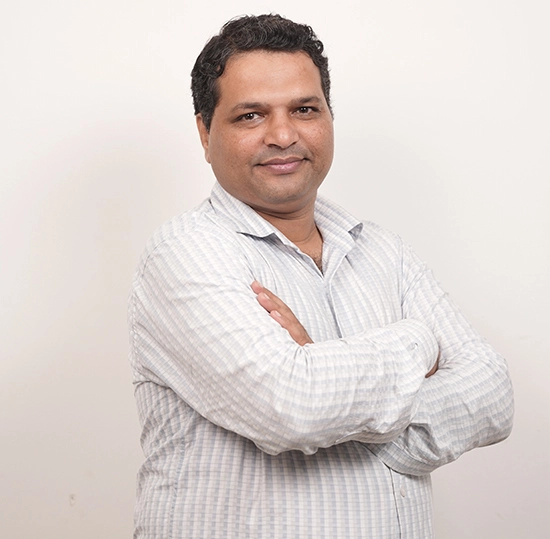
Mr. Sudhir Bakore
GM – OperationsHead of manufacturing and operations having over 29 years of vast experience in the field of Production, Planning, Procurements, Quality, SCM, Assembly & Testing, Maintenance of Pumps and Motors. He is qualified Electrical Engineer and he ensures that quality is the foundation on which anything is built. His leadership inspires everyone in the company to uphold these values and the culture.
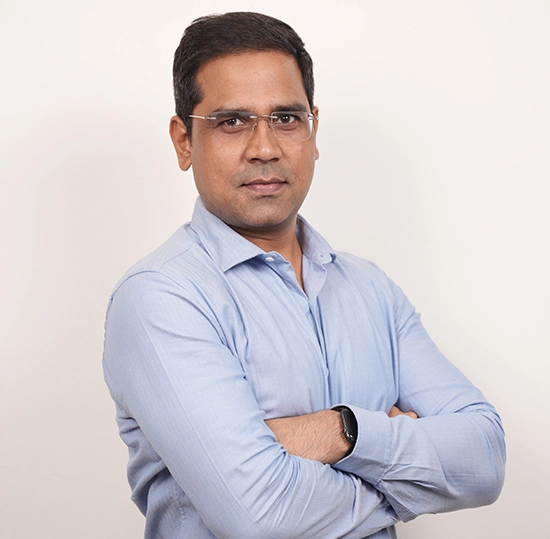
Mr. Khagesh Sahu
Head – International Sales and MarketingA qualified post graduate in International Business and specialized in strategic Management from IIM-Nagpur. He brings with him over 15 years of experience in the field of International sales and Marketing specially in water pumping sector. He has in-depth knowledge of global market. He is engaged in International business development and taking product marketing to its new horizon.
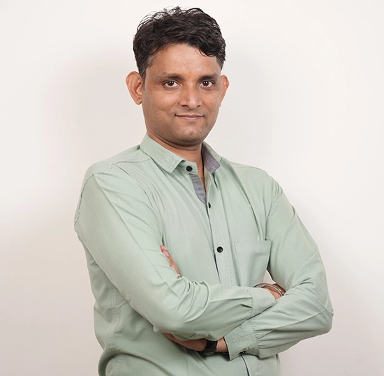
Mr. Dinesh Saxena
Manager – Product Development & ValidationBrings with him more than 12 years of experience in field of integration of solar water pumping, development of Pumps, Selections software and hydraulics analytics, product testing, Quality Control, Training and Development. He is quality Energy Engineer from IIT Delhi. He is actively involved and contributing towards company’s mission.
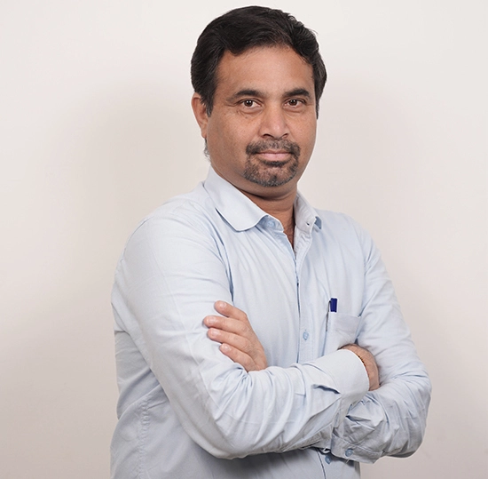
Mr. Vikas Patel
Manager - ProductionHaving more than 21 years of experience in production, planning and logistics specially in Pumps and motors segment. He is engaged in handling manufacturing processes and coordinating production line workers efficiently. He is qualified Electrical Engineer and his contribution is exceptional.